Where the American Dream Goes to Die: Changes in House Prices, Rents, and Incomes since 1960 by Region & Metro
by Wolf Richter Jul 12, 2019
How out-of-whack is the discrepancy in growth between incomes, rents, and house prices?
The San Francisco Housing Crisis, as its called on a daily basis, is an extreme. But housing costs in major urban areas in the US have been eating up more and more of household incomes, as house prices and rents have soared and as incomes have crept up painfully slowly. In many cities, not just San Francisco, this condition is now called a housing crisis where families with median incomes can no longer afford to rent or buy adequate housing, or where too much of their income is spent on housing, with not enough left over for other things. They have no savings, they barely make it to the next paycheck, and they cant help the local economy because housing saps their spending power.
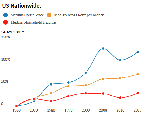
Just how out-of-whack this discrepancy between income versus rents and house prices has become over the years is depicted in a new study with long-term charts, released by the research department of Clever Real Estate. Based on Census data going back to 1960 for median household incomes, median gross rents per month, and median house prices, all adjusted for inflation, it shows that nationally, incomes since 1960 have risen just 29%, while rents have risen 72%, and house prices have soared 121%:
But the national values above reflect everything thrown into one bucket, from the more affordable areas to the biggest housing bubbles. So we will separate them out by region and metro and there are stunning differences.
All values in the charts are indexed to 1960. The charts only include data for the depicted years: 1960, 1970, 1980, 1990, 2000, 2008, 2010, and 2017. The data for the years in between those years are not included. For example, if in one metro, the housing bust bottomed out in 2012, the low point falls between the data points of 2010 and 2017 and is not depicted. But you get the idea.
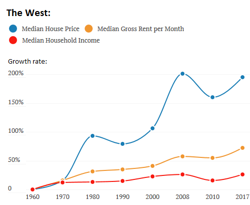
The West: house prices & rents v. household incomes.
In the West a vast diverse region that spans Alaska, Arizona, California, Colorado, Hawaii, Montana, New Mexico, Oregon, Utah, Washington, and Wyoming the median house price, adjusted for inflation, soared 195% since 1960. And rents, adjusted for inflation rose 72%. But household incomes adjusted for inflation ticked up only 26%.
The growth rate (vertical axis) is on a different scale in the charts. For example at the chart above it tops out at 150% growth from 1960; in the chart below, it tops out at 200% growth from 1960; in one chart further down, it tops out at 550% (yup, San Francisco):
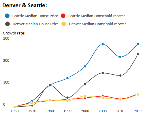
To dissect the changes in house prices and incomes in the West, the study by Clever Real Estate separates out different metro areas. For example, in Seattle and Denver, household incomes, adjusted for inflation, rose in near-lockstep 56% since 1960, while house prices in Denver soared 239%, and in Seattle 286%:
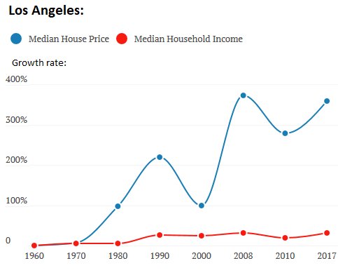
In Los Angeles, the median house price increased 358% since 1960, adjusted for inflation, while the median household income rose only 32%. In other words, house prices increased 11 times faster than household incomes:
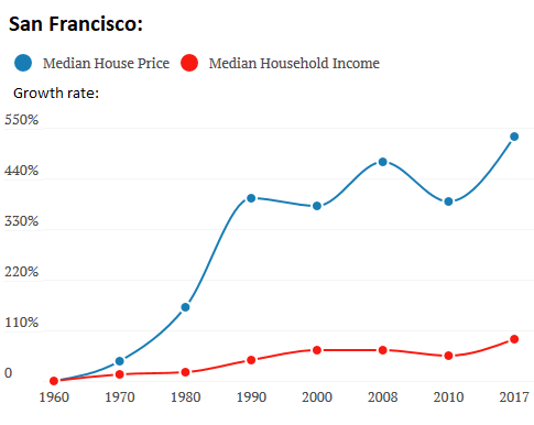
San Francisco is tops, when it comes to house price increases: Since 1960, house prices surged 531% adjusted for inflation. Over the same period, household incomes also rose sharply, but not nearly enough: 91%. In San Francisco where about 1% of the population is homeless and many others are struggling the phrase housing crisis is in daily use for a reason: House prices increased about six times faster than incomes:
The Northeast: house prices & rents v. household incomes.
In the Northeast Connecticut, Maine, Massachusetts, New Hampshire, New Jersey, New York, Pennsylvania, Rhode Island, and Vermont house prices, when adjusted for inflation, have declined from the peak of the prior housing bubble, and are now up only 159% from 1960. They had been up 201% in 2008. Rents rose 84% since 1960 and they have not declined since the last housing bubble, and have continued to outrun inflation. But household incomes rose only 38% since 1960. They did decline between 2008 and 2010 and are now back where they were in 2008:
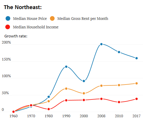
The downward slope of the blue line above a declining median house price since the peak of the housing bubble when adjusted for inflation is unlike the chart for the West and nationwide. Clever Real Estates study explains it this way (all data adjusted for inflation):However, a surprising trend emerged in our data between 2000 and 2017. We observed an increase of 110% in home prices between 2000 and 2008 (i.e., before the financial crisis), and a decrease of 24% between 2008 and 2010 (i.e., after the financial crisis), which real estate analysts expected. However, unusually, home prices dropped by a further 18% between 2010 and 2017, while household income increased by 9% between these years.
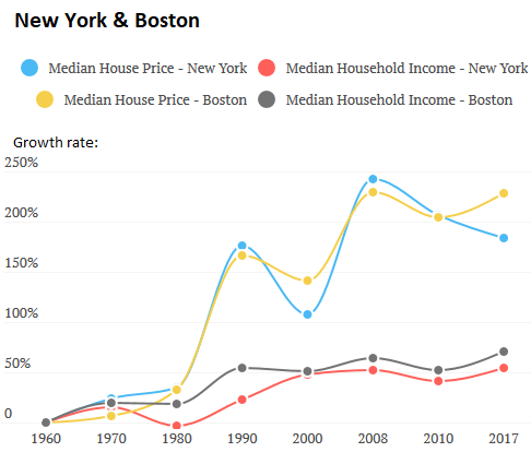
This trend in the Northeast overall is not the case in Boston. Adjusted for inflation, house prices in Boston, after falling 25% during the housing bust, are back where they were during the peak of the prior housing bubble, and are up 228% from 1960. But house prices in the New York metro, adjusted for inflation, while up 184% from 1960, have declined in real terms since the peak of the prior housing bubble.
Since 1960, median household incomes have risen only 71% in Boston and 54% in New York, adjusted for inflation, far outstripped by the surge in house prices:
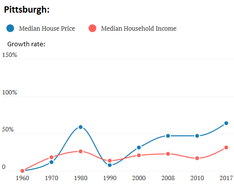
In Pittsburgh, house prices have by far surpassed the peak of the prior housing bubble, which wasnt much of a bubble, and are now up 64% since 1960, adjusted for inflation. The median household income rose 31% over the same period, a relationship to house prices that seems almost sane compared to the utter madness in the West:
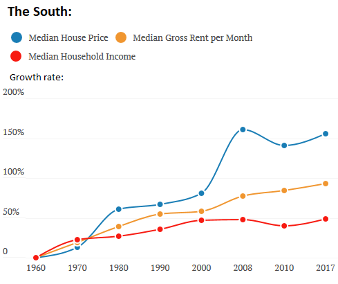
The South: house prices & rents v. household incomes.
In the South Alabama, Arkansas, Delaware, D.C., Florida, Georgia, Kentucky, Louisiana, Maryland, Mississippi, North Carolina, Oklahoma, South Carolina, Tennessee, Texas, Virginia, and West Virginia house prices rose 156% since 1960, and rents 93%, while household incomes rose only 49%, all adjusted for inflation.
This region includes some of the poorest and lowest-cost and lowest-income states in the US, but it also includes high-cost and high-income states. In some cities in the region, real estate has gone through some mind-boggling booms and busts. Washington D.C., Miami, and Tampa are examples and theyre included in my glory list of The Most Splendid Housing Bubble in America. So this here is everything in the big and diverse South thrown into one chart:
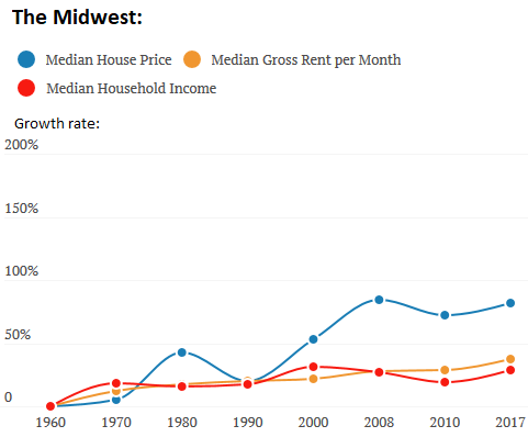
The Midwest: house prices & rents v. household incomes.
In the Midwest Illinois, Indiana, Iowa, Kansas, Michigan, Minnesota, Missouri, Nebraska, North Dakota, Ohio, South Dakota, and Wisconsin house prices increased a practically reasonable 82% since 1960 adjusted for inflation, while rents rose 37% and incomes 29%:
As sample cities for the Midwest, the Clever Real Estate study selected St. Louis and Cincinnati. In both cities, adjusted for inflation, house prices are still down from the peak of the prior housing bubble. And incomes, also adjusted for inflation, are about flat with the mid-1990s:
In some of the hottest most overpriced rental markets, changes are afoot. Read
Apartment Rents Fall in Seattle, Southern California, New York, Oakland, San Jose, Chicago, Honolulu
https://wolfstreet.com/2019/07/12/ch...d-major-metro/


 Reply With Quote